Design history · 1960s

Paul Rand

The designer who taught corporate America that logos are systems.

Paul Rand (1914–1996) is the American graphic designer who translated European modernism into the language of postwar American business. His logos for IBM, UPS, ABC, Westinghouse and NeXT are among the most recognisable in the world — and his 1947 book Thoughts on Design remains a foundational text for anyone learning the craft.

Key facts

Born
15 August 1914, Brooklyn, New York
Died
26 November 1996, Norwalk, Connecticut
Nationality
American
Era
Mid-century modern / corporate identity
Studios
Weintraub Advertising Agency · Independent practice · Yale faculty
Known for
IBM, UPS, ABC, NeXT, Westinghouse logos · Thoughts on Design (1947)

Biography

Paul Rand was born Peretz Rosenbaum in Brooklyn in 1914 to Orthodox Jewish parents. He began drawing commercial signs for his father’s grocery store as a child, and by his mid-teens he had enrolled in Pratt Institute, Parsons, and the Art Students League simultaneously — none of which, he later said, taught him much. What taught him was the European avant-garde: Bauhaus books, De Stijl, Moholy-Nagy, Lissitzky. He Americanised his name before turning twenty and never looked back.

His first design break came in the early 1940s at the Weintraub Advertising Agency, where he art-directed campaigns that brought European modernism into American mass media. In 1947 — still in his early thirties — he published Thoughts on Design, a slim book of essays that became a touchstone for a generation of designers trained after him.

From 1956 onwards, Rand’s corporate identity work defined the postwar American visual landscape. IBM hired him in 1956 and kept hiring him for forty years. UPS, Westinghouse, ABC, Cummins Engine, Yale University Press and — in a famous late-career engagement with Steve Jobs — NeXT Computer all commissioned marks that became part of everyday life.

He taught at Yale School of Art from 1956 until his death in 1996, shaping designers who would themselves shape the next decades of the profession. His approach was relentlessly verbal as well as visual: every major mark was accompanied by a written argument.


Design philosophy

Rand’s position — stated plainly in Thoughts on Design and repeated in every identity presentation he ever gave — was that design is the marriage of form and content, and that a logo’s job is not to describe a business but to identify it.

“A logo derives its meaning from the quality of the thing it symbolises, not the other way around.” — Paul Rand, Design, Form, and Chaos (1993)

He was hostile to design-by-committee, dismissive of market research as a substitute for craft judgement, and unshakeably committed to the idea that simplicity is a result of discipline, not absence. His IBM presentation books — pages of hand-drawn diagrams explaining why eight stripes, why those proportions, why City Bold — remain the gold standard for how to defend a design decision in front of a boardroom.

His second premise: form plays. A logo must be systematic enough to survive reproduction at every scale, but it must also contain a spark of visual wit. The ABC circle, the UPS parcel, the bug-eyed Eye/Bee/M rebus: Rand’s marks reward a second look.

Key works

IBM (1956, refined 1972) — what began as a refinement of IBM’s earlier identity evolved into the striped wordmark used across the IBM Graphic Standards Manual. A masterclass in treating a logo as a system, not an object.

UPS (1961) — a heraldic shield topped with a parcel. In use for over forty years. Replaced in 2003, to little improvement.

ABC (1962) — lowercase letters in a circle. Still in use today, unchanged in all essentials, on one of the world’s largest broadcasters.

Westinghouse (1960) — a geometric, circuit-inspired mark designed for a pre-digital electrical giant. Rand’s 52-page presentation book remains in print as a pedagogical object.

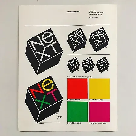
NeXT (1986) — commissioned by Steve Jobs with a brief to design a single logo for $100,000. Rand delivered one option plus a 100-page book explaining it. Jobs accepted without changes.

Iconic works

Paul Rand, IBM logo, 1956

IBM logo

1956

Rand's appointment as IBM design consultant in 1956 produced a clean wordmark based on City Medium. The horizontal-striped variants — 8 bars and 13 bars — were introduced in 1972 and codified in the IBM Graphic Standards Manual, which governed every IBM application from stationery to equipment livery.
Paul Rand, IBM logo (1956). · Paul Rand · Public domain

UPS logo (shield + parcel)

1961

Commissioned by United Parcel Service in 1961, Rand retained the shield form but stripped all decorative lettering, adding a tied parcel above the crest to signify the company's core function. The mark served as the primary UPS identity for forty-two years before a FutureBrand redesign replaced it in 2003.
Paul Rand, UPS logo (1961). · Unknown author Unknown author · Public domain

ABC logo

1962

Commissioned by the American Broadcasting Company in 1962, the mark sets a custom lowercase letterform inside a perfect circle — a unit that reproduces clearly at any scale. It remains in use today with no substantial modification, making it one of the longest-lived broadcast identities in American television.
Paul Rand, ABC logo (1962). · Paul Rand · Public domain

Westinghouse logo

1960

Designed for Westinghouse Electric Corporation in 1960, the mark abstracts a circuit schematic into a bold, modular W built from a repeating geometric unit. Rand delivered the identity with a 52-page presentation booklet — an early model of how to argue a design decision in writing to a client.
Paul Rand, Westinghouse logo (1960). · Paul Rand · Public domain
Paul Rand, NeXT logo, 1986

NeXT logo

1986

Commissioned by Steve Jobs for NeXT Computer in 1986, the mark tilts a square to 28 degrees and sets the company name in custom type on a ruled grid within the cube face. Rand presented a single option only, accompanied by a 100-page bound presentation; Jobs accepted without revision.
Paul Rand, NeXT logo (1986). · Official branding specification sheet from Paul Rand's archive showing the NeXT logo with technical construction grid and measurements. · AU statutory
Paul Rand, Thoughts on Design, 1947

Thoughts on Design

1947

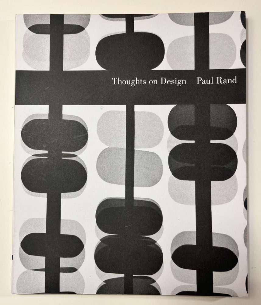
First published by Wittenborn Schultz in 1947, the book collected Rand's essays on form, function, and visual communication, illustrated with examples from his advertising and editorial work. A defining statement of American design modernism. Reissued by Chronicle Books in 2014 with a foreword by Michael Bierut.
Paul Rand, *Thoughts on Design*, 1947. · Cedric Price Generator Project, White Oak, Florida,Selection of Design Thoughts Used within the Office, C 1978-80 · Museum editorial
Paul Rand, Design Form and Chaos, 1993

Design, Form, and Chaos

1993

Published by Yale University Press in 1993, the book presents extended essays from Rand's teaching at Yale, arguing for formal rigour over decorative eclecticism. The NeXT identity project is documented in detail with reproductions of the original presentation materials.
Paul Rand, *Design, Form, and Chaos*, Yale University Press, 1993. · Will Wright SimCity 2000 1993 · Museum editorial

Influence & legacy

Rand’s direct lineage runs through Yale: Chermayeff & Geismar, Bradbury Thompson, Ivan Chermayeff, and — at a generational remove — Michael Bierut and Armin Vit. His indirect influence is harder to bound. Every subsequent corporate identity system — from the 1970s-era Chermayeff & Geismar Mobil and Chase marks to the late-century AT&T death star — was drafted, consciously or not, against Rand’s template.

He also shaped how designers talked about their work. The idea that a logo is delivered with a written argument — a rationale that explains every decision — is now standard professional practice. Rand made it so.

His books continue to sell. Thoughts on Design is on every reading list for every serious graphic design programme, including ours.

Learn at TGDS

Paul Rand sits across several modules of our curriculum. If his work interests you, the most direct next steps are:

Courses

Further reading

Books

  • Paul Rand, Thoughts on Design (Wittenborn, 1947; Chronicle Books reissue, 2014).
  • Paul Rand, Design, Form, and Chaos (Yale University Press, 1993).
  • Paul Rand, A Designer’s Art (Yale University Press, 1985).
  • Steven Heller, Paul Rand (Phaidon Press, 2000) — the definitive monograph.
  • IBM Graphic Standards Manual (1972; Empire Editions reissue, 2017).

Get Started.

You can enrol any day of the year. We are online and study is self-paced, there is no pressure. Enrol when you are ready to start, from anywhere in the world. If you would like to chat or email, feel free to get in touch.

Brochures, Phone Calls & Questions

You can download a free brochure, book a phone call with one of our course advisors, or simply ask a question.

Other ways to get in touch

Australia 1300 655 485

International +61 1300 655 485

Ask Anything info@thegraphicdesignschool.com

Get a quote accounts@thegraphicdesignschool.com

Acknowledgement of Country
The Graphic Design School acknowledges the Traditional Custodians of Country throughout Australia and their continued spiritual connection to land.
We pay respect to Elders past, present and emerging.
Always was, always will be.
RTO Provider № 91706